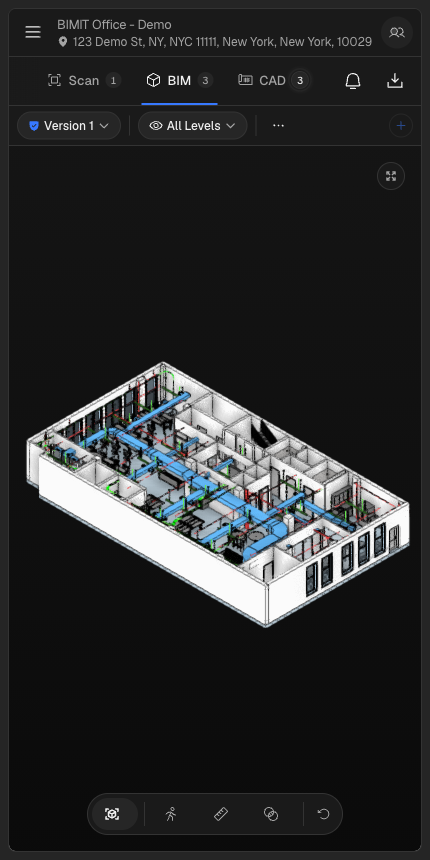
Navigating the platform on mobile
The main navigation moves into a slide-in drawer. Tap the hamburger menu in the header to open it. Tap the ✕ button or anywhere on the backdrop to close it. The header automatically truncates long location names and addresses so they don't overflow on narrower screens.
Tabs across project detail pages scroll horizontally, and labels condense to icons to keep them accessible without crowding the screen.
Viewer toolbars
All viewer toolbars — including the BIM, CAD, map, images, scan, and report views — move secondary actions into an overflow menu. The most-used controls stay visible; tap the overflow icon to reach the rest. Primary viewing and navigation behavior is unchanged.
Settings and team management
The Settings modal opens full-width on mobile, with tabs displayed as underlined labels rather than the sidebar-style layout used on desktop. Team members, previously shown in a table, are now listed as individual cards — easier to read and scroll through on a small screen.
Image galleries
Photo galleries and grouped image galleries reflow to a single column. Images are the same size and quality; they just stack vertically instead of appearing in a grid.
Desktop is unchanged
All of these layouts are screen-width-aware. At widths above 768 px — the typical laptop or monitor breakpoint — nothing looks or behaves differently from before. If you notice any layout regressions on desktop, let us know.